Claude for Excel · From Data to Decisions
Pivot Tables
Summarize thousands of rows in plain language
A Clear View of 2K Rows
A transaction log can contain everything you need — and still leave you hunting through hundreds of rows for one simple answer.
In this lesson, you'll turn a long order log into a PivotTable by describing the summary you need, reshaping it as new questions come up, and checking the result before you share it.
Let's get started!

Scenario: The Monthly Review
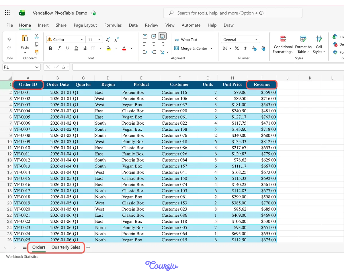
Imagine you're an account manager at Vendaflow, a snack-box supplier you met earlier in this course. The Orders tab has 1,872 rows — one order per row — and your monthly review is tomorrow.
Your manager needs to see sales by product, region, and quarter. The detail is all there, and now you need the summary.

You could build a grid of formulas for every product and quarter. But this question has a different shape: the same measure needs to be grouped and compared across several categories.
That's where a PivotTable is a better fit.
A PivotTable turns a long list of rows into a compact summary. You choose what to group, what to compare, and which number to calculate without building a separate formula for every combination.
practice preview
Interactive practice
True / False
Choose the better tool for the question.
Start With the Question
Before you build the PivotTable, name the question it needs to answer:
"How much revenue did each product generate in each quarter?"
That question already contains the layout.
- The product gives you the rows because you want to compare one product with another.
- Quarter gives you the columns because you want to see how those products change across time.
- Revenue gives you the values because that’s the number you want to calculate and compare.
And because the question asks for the revenue, the values need to be added together using "Sum".
Rows hold the groups you want to compare. Columns split them across another dimension. Values hold the measure and the calculation, such as Sum, Average, or Count.
practice preview
Interactive practice
Fill in the blank
Turn the question into a PivotTable layout.
Nicely done! 1,872 orders are now a compact summary of four products across four quarters.
Claude may ask for permission before changing the workbook. Review the proposed change, then allow it when the requested layout matches what you asked for.
The first useful view is ready — but it won't be the last question your manager asks.

The First Layout Is a Starting Point
Your manager looks at Q4 and asks: "Is the growth spread across the business, or is one region driving it?"
The current view has Product and Quarter, but no Region. You don't need to rearrange the PivotTable manually. Ask Claude to reshape it around the next question.
practice preview
Interactive practice
Fill in the blank
Extend the summary with the dimension the next question needs.
Good job! The same PivotTable can now answer the product-by-quarter question for the whole business or for one region at a time.
The source data hasn't changed. You changed how the summary is viewed.
Change What the Summary Measures
Total revenue tells you how much came in. But it doesn't tell you whether Q4 growth was driven by more orders or by larger orders.
The same data can answer that question too — you just need different calculations in Values.
Because each row represents one order and every order has an Order ID, Count of Order ID gives you the number of orders.
The Average of Revenue gives you the average revenue per order.
You can place both next to total revenue and compare all three.
practice preview
Interactive practice
Fill in the blank
Add the measures that explain how the total changed.
Nicely done! Q4 had 41 more orders than Q3, while average revenue per order increased by only about $2.
The total went up mainly because Vendaflow received more orders, not because individual orders became much larger.
- Sum answers how much.
- Count answers how many.
- Average answers how large each record is on average.
Choose the calculation that matches the question you're trying to answer.
One Answer Raises the Next Question
Now you know that more orders drove most of the Q4 growth. The next question is: "Where did that growth come from?"
The Region is already part of the PivotTable. Ask Claude to restructure the summary so the regions can be compared directly.
practice preview
Interactive practice
Fill in the blank
Reshape the summary around the next question.
Good job! You didn't have to return to the order log and build another summary by hand. You changed the question, and Claude reshaped the PivotTable around it.
That flexibility is useful, but before the numbers go into the monthly review, the summary needs one final check.

Before It Leaves the Workbook
A PivotTable is a summary of the source data. Before you present it, make sure its Grand Total reconciles with the data it came from.
For this view, total revenue in the PivotTable should equal total revenue in Orders.
practice preview
Interactive practice
Fill in the blank
Check the summary against its source before sharing it.
practice preview
Interactive practice
True / False
Check whether the summary matches the claim you're making.
A total can be correct for a filtered view and still be wrong for the claim you're making. Reconcile the numbers, then check which filters and groups are shaping the view.
Review, Ready
Nice work! The 1,872-row order log now gives you the views the monthly review needed:
- Product sales across quarters.
- The same summary filtered by region.
- Order count and average order value when the total needed explanation.
- Regional and product breakdowns when the next question came up.
- A Grand Total checked against the source data

The process stays the same:
- Name the question.
- Choose the groups: what belongs in rows, columns, or filters?
- Choose the measure: what belongs in values, and how should it be calculated?
- Reshape the view when the next question appears.
- Reconcile the result before you share it.
- Use a PivotTable for grouped summaries: It's a strong fit when the same measure needs to be compared across categories, periods, or other dimensions.
- Describe the layout clearly: Name what belongs in rows, columns, filters, and values — and how the values should be calculated.
- Treat the first layout as a starting point: When the question changes, ask Claude for the layout the next question needs.
- Match the calculation to the question: Sum, Count, and Total.
- Verify before you present: Reconcile the Grand Total with the source and check the scope of any active filters.
What's Next?
Great job! You've turned a long transaction log into summaries that can change as the questions change without rebuilding every view by hand.
Next, you'll turn those verified summaries into charts and a one-screen dashboard. You'll choose each visual based on the message it needs to show, then trace every displayed number back to the summary behind it.
Let's keep going!