A spreadsheet can give you a number in seconds, but understanding whether that number is worth acting on takes more than reading the result. That becomes especially important when someone asks you to explain what’s behind it.
In this lesson, you'll dig past the surface of your data to where the real answer lives, catch a figure that's confidently wrong, and test what happens when you change an assumption — all without breaking a single formula.
Let's get started!
Scenario: The Margin Dip
Imagine you're a category manager at Velmix — the drinks company whose quarterly summary you repaired earlier in this course. That file has grown up: it now carries prices, costs, and a margin model.
This morning, your manager sends one line: "Margin is down. I need to know why by Thursday."
You could paste that question straight into the sidebar. But there's one word in it worth slowing down for: margin.
It can mean gross margin, margin after discounts, margin after shipping — and each one gives a different answer. Claude will use whichever definition it finds. So you name the one you mean, and ask it to elaborate on the assumption.
practice preview
Interactive practice
Fill in the blank
Ask the headline question — and pin down what "margin" means before Claude picks for you.
Good job! 3 regions barely moved. North fell by 8.7 points, dragging the company down with it.
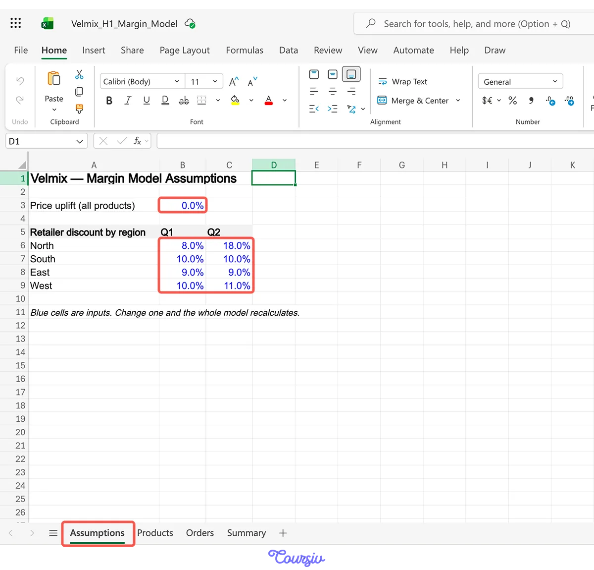
One follow-up: "Why did North's margin fall?" and Claude traces it to a single cell on the Assumptions tab: North's retailer discount went from 8% in Q1 to 18% in Q2. A chain renegotiated.
A company-wide number is where the question starts. Break it by region, category, or month, and the cause usually shows up in 1 piece.
One Number Doesn't Fit
The regional diagnosis still holds. But before you build a recommendation from the workbook, you need to check whether the supporting data is complete.
The categories on the Summary tab total 91,147 cases. The Orders tab has 100,807. Nearly 10,000 cases sold, sitting in no category at all.
practice preview
Interactive practice
Fill in the blank
Ask Claude to reconcile the totals and explain what's behind the difference.
A quick, clean result can still depend on hidden assumptions — a zero, a blank, or a row that wasn’t included. Before you rely on a figure, check what went into it and what may have been left out.
Now Ask "What If?"
You know the cause: North's discount doubled. The obvious next question is the one your manager will ask on Thursday — how much would we get back if we pulled it down?
On the Assumptions tab, the blue cells are inputs. Change one, and every formula that depends on it recalculates: 1,400 order rows, every rollup, the headline.
Without a live model, testing an idea means copying the whole sheet to a new tab, retyping numbers, and hoping you didn't miss a cell.
Here, you change the input and read the result. The formulas stay exactly as they are.
practice preview
Interactive practice
Fill in the blank
Test the recovery — change the input, keep every formula untouched.
But a discount you can pull back is one you have to negotiate. So before recommending it, put it next to the alternative.
Two Scenarios, Side by Side
A number means more when it's standing next to another one.
The second option: leave the discount alone and raise list prices 3% across the board. Same model, but this time you’ll change a different input: the price uplift.
practice preview
Interactive practice
Fill in the blank
Run both scenarios and lay them side by side with the trade-off named.
Scenario B looks better by $4,441, and that's exactly why you asked for the trade-off.
Extra margin in scenario B assumes nobody buys less at a higher price, and it raises prices in 3 regions that did nothing wrong.
Scenario A costs less, and it fixes the thing that actually broke.
A single scenario shows one possible outcome. Comparing two scenarios using the same criteria makes the trade-offs clear and supports a stronger recommendation.
Thursday, Solved
Nice work! You've prepared your analysis and are now ready for the report:
Margin fell 3.0 points. It's all North, where the discount went from 8% to 18%.
Two products are unpriced, dragging down every category figure.
Pulling North back to 12% returns $19,180. A price rise would earn more and cost more trust.
A strong analysis usually moves through the same five questions:
What changed? Establish the result or movement you need to explain.
Where did it change? Break the headline number down to find where the movement is concentrated.
Why did it change? Trace the result back to the inputs, assumptions, or events behind it.
Can I trust it? Check what was included, excluded, missing, or assumed.
What should we do? Test possible actions and compare their trade-offs.
The data and business question will change, but this sequence gives you a reliable way to investigate both.
Define the measure before you analyze it: Make key terms explicit so Claude works from the same definition you do.
Move from the headline to the driver: Break results down by the dimensions that matter, then trace the biggest movement back to its source.
Verify before you interpret: Check totals, blanks, zeros, missing records, and assumptions before turning a result into a conclusion.
Use what-if analysis to isolate effects: Change one assumption at a time when you need to understand how that input affects the model.
Compare options on the same criteria: Look at the outcome, the assumptions behind it, and the trade-offs before making a recommendation.
What's Next?
Great job! You've just moved from a headline number to a reliable explanation by defining terms, breaking results down, checking suspicious figures, and comparing scenarios.
Next, you'll turn large transaction logs into clear summaries with pivot tables. You’ll describe the view you need, refine it as new questions come up, and verify the totals before sharing the result.