Claude for Excel · From Data to Decisions
Visuals Worth Presenting
Turn summaries into insightful dashboards
The Story in One Screen
A workbook can contain the right numbers, but for a presentation, it might not be enough. The data visualization is what Claude for Excel can help you with!
In this lesson, you'll turn verified summaries into charts people can read quickly, build a one-screen dashboard, and check every displayed number before you present it.
Let's get started!

Scenario: Twelve Tabs, No Story
Imagine you're a team lead at Northframe. The monthly review runs on a workbook with twelve tabs: revenue, margins, regions, monthly trends, and the summary tables behind them.
The numbers are ready. Your job is to turn the quarter into one screen that answers two questions: What changed? And where did it come from?

The first decision is the message the visual needs to convey, making it easy to see.
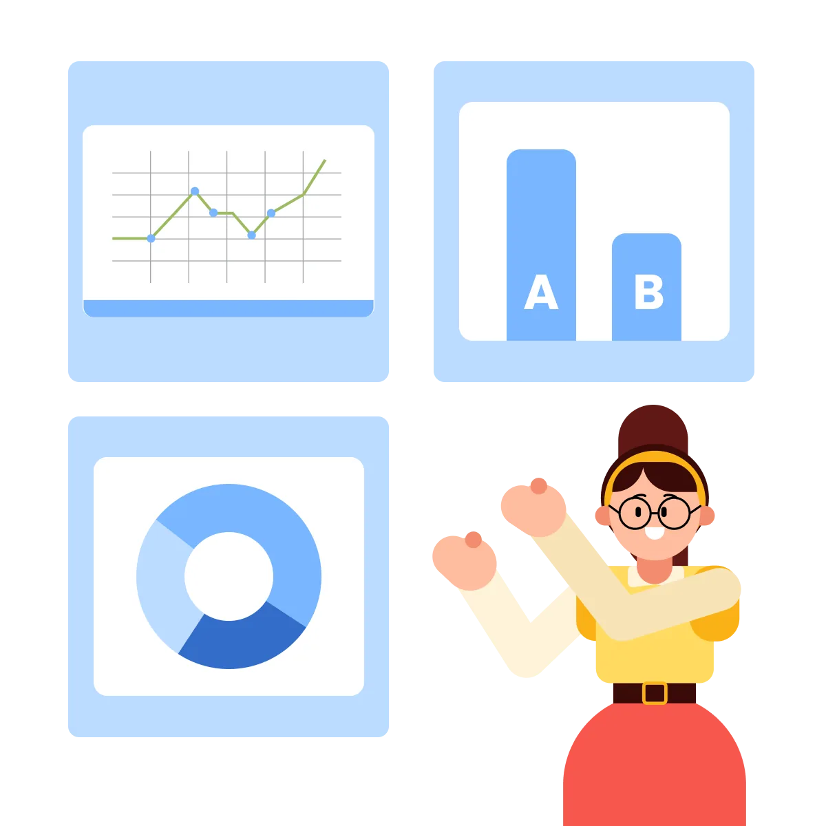
Different questions have different shapes:
- Trend: How did something change over time? Better convey in a line chart.
- Comparison: Which category is higher or lower? Better convey in a bar chart.
- Composition: How is a whole divided into parts? Better convey in a donut chart.
Choose the message first. Then choose the chart.
practice preview
Interactive practice
Match pairs
Tap a left item, then a right item to match.
Start with the question the visual needs to answer. Once you know whether you're showing a trend, comparison, or composition, the chart choice becomes much easier.
Start With the Trend
Your first question is:
"How has revenue moved across the year, and what happened in the latest quarter?"
The Monthly Summary tab has one revenue figure for each month from January to December. The order matters because time is a sequence.
That makes a line chart a natural starting point.
practice preview
Interactive practice
Fill in the blank
Turn the monthly summary into a chart that shows movement over time.
Nicely done! The chart now shows the full year in one view. Revenue softened in September, then rose through each month of Q4.
The data is correct, but a correct chart isn't automatically effective. Your audience still needs to see the main point quickly.

Describe the Read You Want
You could tell Claude which individual chart elements to change one by one.
Or you can describe the result you need:
"Make the Q4 acceleration easy to see at a glance for a leadership audience."
That gives Claude a clearer goal for the whole visual.
practice preview
Interactive practice
Fill in the blank
Refine the chart around what the audience should notice.
Good job! The chart still shows the same twelve numbers. What changed is the reading experience: the latest movement is easier to find, and details that don't help the message get less attention.
Tell Claude what the audience should notice and how quickly they should notice it. The goal of the chart matters more than a list of formatting instructions.
Find Where the Growth Came From
The trend shows that Q4 improved. The next question is where that increase came from.
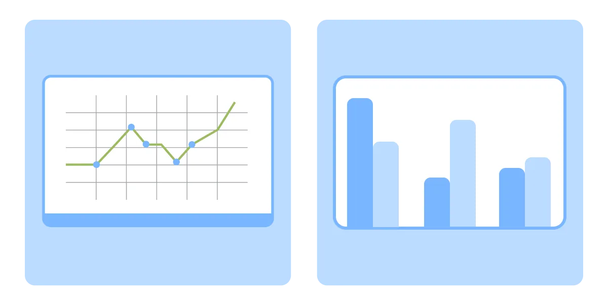
The Regional Summary compares Q3 and Q4 revenue across North, South, East, and West.
You could use another line chart. But regions aren't points in a sequence.
practice preview
Interactive practice
True / False
Decide whether the chart shape fits the question.
practice preview
Interactive practice
Fill in the blank
Compare the regions and make the biggest change easy to find.
Nicely done! The breakdown shows that Q4 revenue increased across the regions, but not equally.
North had the largest increase, contributing $80,000 of the $195,000 gain from Q3 to Q4.
The trend told you what changed. The breakdown shows where the change came from.
From Two Charts to One Dashboard
You now have the two visuals the review needs:
- One trend showing how revenue moved across the year.
- One breakdown showing how Q3 and Q4 compare by region.
Now they need context, as a viewer shouldn't have to calculate the headline result from the charts.
At the top of the dashboard, add three numbers that frame the quarter:
Q4 Revenue: $2.27M Growth vs. Q3: +9.4% Gross Margin: 34.1%
Then keep the monthly trend and regional breakdown underneath.
Three headline numbers, one trend, one breakdown. Everything on one screen.
practice preview
Interactive practice
Fill in the blank
Bring the headline figures and visuals together around one audience need.
Good job! The twelve-tab workbook now has one place to start.
A viewer can see the quarter's scale, direction, and main regional driver without opening the source tabs first.
Finish Or Keep Going?
Imagine someone opens the dashboard just before the meeting.
Within 10 seconds, they should be able to answer:
- How did the quarter perform?
- What changed over time?
- Where did the change come from?
If the screen can't answer those questions quickly, adding more charts won't fix it.
practice preview
Interactive practice
True / False
Judge the dashboard by the audience's question, not by how much information it contains.
A dashboard doesn't need to display everything the workbook knows. It needs to make the most important answers easy to find for a specific audience.
Trace Every Number Back
The dashboard is clear. Now it needs to be trustworthy.
A large headline number or polished chart can still point to the wrong range, an outdated summary, or a filtered view.
Before the meeting, trace every dashboard element back to its verified summary.
practice preview
Interactive practice
Fill in the blank
Check the presentation layer against the summaries that feed it.
Nicely done! Each displayed result now has a clear source.
The dashboard is the presentation layer. Its trust comes from the verified summaries underneath it.
Review, Ready
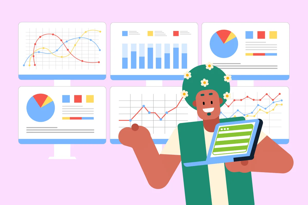
Nice work! The dashboard now gives leadership:
- Three headline figures for the quarter.
- One trend showing how performance moved over time.
- One breakdown showing where the change came from.
- A layout that can be understood quickly.
- A verified source behind every displayed result.
- Choose the chart from the message: Use the shape of the question to guide the visual.
- Design for the intended read: Tell Claude what the audience should notice, not only which chart features to change.
- Keep the dashboard focused: A few headline figures and purposeful visuals are more useful than a screen that reproduces every table.
- Test the result against the audience's questions: A dashboard works when the important answers are easy to find quickly.
- Verify the presentation layer: Trace every headline number and chart back to the summary or PivotTable behind it.
What's Next?
Great job! You've moved from raw data to verified summaries, and then turned those summaries into a dashboard people can quickly understand.
Next, you'll take the recurring work behind your reports and turn it into a repeatable workflow, so the process doesn't have to start from scratch every time.
Let's keep going!