ChatGPT: Deep Dive · Build and Create
Image Generation: Cohesive Design Sets
Create a cohesive visual campaign
Create a Consistent Image Set
You've likely made single images before: created a scene, an illustration, or a quick graphic. This lesson goes a step deeper: making a set of images in the same style and colors that look like they belong together. You'll build the full look for an event and keep it consistent across every piece.
Let's get started!
Scenario: A Workshop You're Running
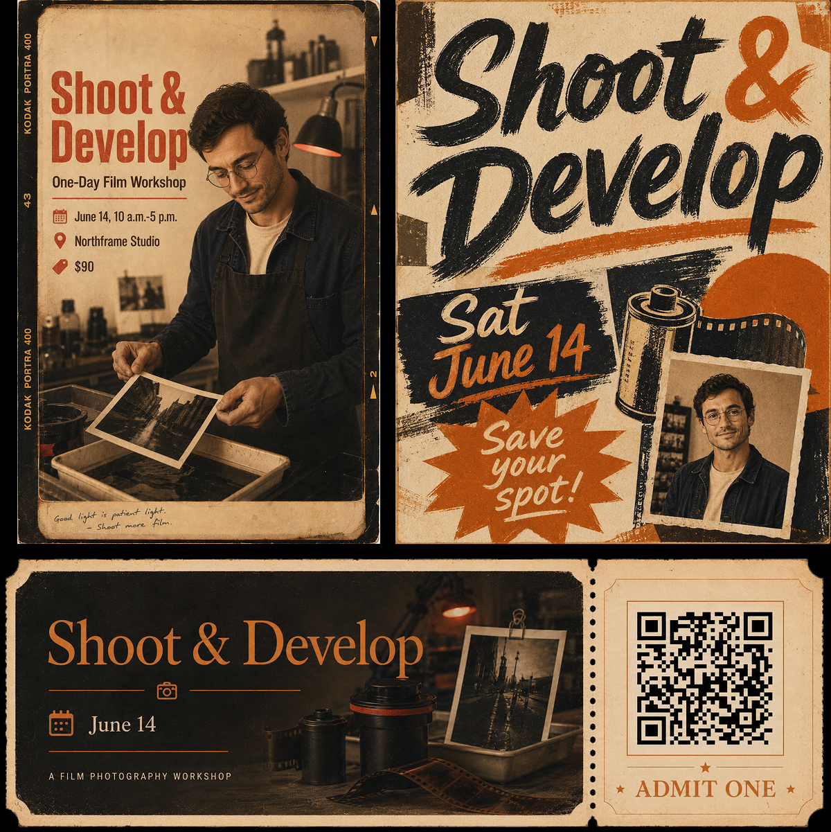
Imagine this: you're running a one-day film photography workshop — Shoot & Develop at Northframe Studio. It needs three different pieces that have to feel like the same event:
- A poster for the wall
- A post for Instagram
- A ticket for everyone who signs up

The hard part is making all three share the same colors, style, and instructor's face, so they read as a coherent campaign. That consistency is the skill you'll build in this lesson.
The Image Workspace
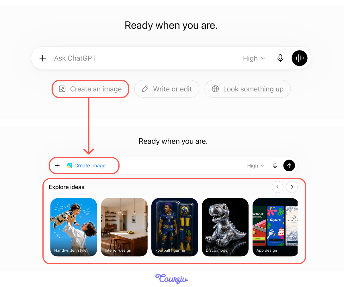
Open ChatGPT's image tool and you'll see a single prompt box with a row of ready-made ideas underneath. There are many presets at the bottom of the screen. Scroll across, and you'll find a whole set to browse.
A Preset Worth Using
Those presets are real shortcuts. Each one is a finished, polished look in a single tap, and most start from a photo you upload.
Handwritten style, for instance, takes one of your own pictures and lays it out like a poster, with hand-lettered captions scattered across it — the kind of warm, personal styling that isn't far from what an event poster wants.
Where a Preset Stops
A preset is a strong starting point, and you can edit its prompt to make the image look the way you want. But it's built for a single, personal image — not for maintaining a consistent look across the image set.
The more your real goal differs from the preset's purpose, the more you're rewriting anyway. For a campaign, it's cleaner to write your own from the start.
practice preview
Interactive practice
True / False
Decide whether a one-tap preset is enough for this job, or you need your own prompt.
Define the Identity First
Consistency starts before you generate anything — by deciding the look you'll reuse. If you're not sure what that should be, ChatGPT can help you brainstorm it: describe the event and ask for a few distinct visual directions, then pick one to commit to.
practice preview
Interactive practice
Fill in the blank
Complete the prompt that asks ChatGPT to propose visual directions before you generate.
Lock It In
From the directions ChatGPT offers, you go with the recommended Golden Hour Nostalgia:
- A soft vintage photography look
- Faded textures
- Handwritten notes
- Warm film borders
- A palette of honey yellow, burnt orange, cream, and dusty brown
- The instructor as the consistent face for the campaign
When choosing the visual direction, save the details, because you'll reuse the suggested words on every visual asset.
Build It in Order
A set comes together best built in sequence, not all at once. You make the anchor piece first, get it right, then carry its look to the others. Let's put the steps in order.
practice preview
Interactive practice
Put in order
Arrange the steps to build a set of images that share a single identity.
Start With the Anchor
The poster is your anchor — the piece whose look everything else copies, so it earns the most care. It's also the most demanding: it has a lot of text, demands a clear layout, and includes a real photo of a person. That combination is where a slower, more deliberate mode pays off.
The Intelligence Level
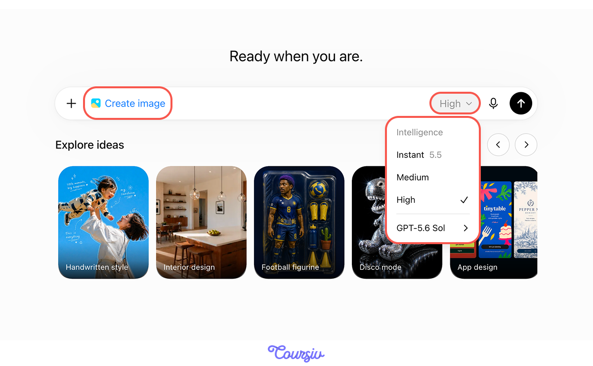
Next to the prompt box, an effort dropdown lets you choose the Intelligence level — Instant, Medium, High.
Instant is quick. Medium and High plan the layout before rendering, which holds up better for dense text and structured designs like a poster.
The instructor should be the same person in every piece, not a new stranger each time. To pin that down, upload a real photo of them and add the line "keep facial features exactly." From there, the same face carries across the poster, the post, and the ticket.

Set the Shape
One more choice before you generate: the aspect ratio. Include the required ratio directly in the prompt.
For a poster, you pick Portrait 3:4, which closely matches a printed poster's shape.
Images are rendered at screen resolution, which is fine on a phone or laptop but too light for large print. To print a poster at full size:
- Generate at the highest available quality, in the correct aspect ratio.
- For anything bigger than a sheet of paper, run the result through an image upscaler before printing — it adds the pixels a sharp, large print needs.
practice preview
Interactive practice
Fill in the blank
Complete the prompt that generates the campaign's anchor piece.
Across the prompts for all the images from the set, these tips will help you:
- Choose the format and shape — the medium and aspect ratio, set before you generate.
- Describe composition, lighting, and style with concrete words.
- Use Thinking for text-heavy or structured layouts, and Instant for quick, simple images.
Proofread Before You Reuse
The poster comes back looking sharp — but read every word before you do anything else. Check the workshop name, date, time, and price.
Text rendering is strong but not flawless, so an incorrect start time is cheap to fix here but costly after it's printed.
Carry the Brand, Not the Whole Look
The post still has to read as the same campaign — but it doesn't have to copy the poster. What carries a brand across formats is the palette and the instructor's face, not an identical layout.
So this time you'll keep those two fixed — palette and face — and deliberately change the style. You still feed the poster in as a reference — you just tell ChatGPT what to keep and what to change.
Select all that apply
What keeps a set looking like one campaign, even when the pieces aren't identical?
practice preview
Interactive practice
Fill in the blank
In the same chat, complete the prompt that creates an Instagram post.
What Has to Stay the Same
Put the poster and the post side by side. The styles should look different — that's the point — so check the two things that must hold:
- Did the palette stay honey and burnt-orange?
- Is it the same face?
If either slipped, fix that one piece against the poster rather than accepting a set that only half-matches.
When a piece is mostly right but one detail is off — the color drifted, a word is misspelled, the face changed — you don't regenerate the whole image.
Describe just the change: "keep everything the same, only correct the date to June 16." The model edits that element and leaves the rest intact, so you don't lose the version you already liked.
A Ticket People Can Scan
The ticket has another feature: a QR code that links to the sign-up page. ChatGPT can build working, scannable code directly into the design, styled to match the rest of the set.
practice preview
Interactive practice
Fill in the blank
Complete the prompt for the third piece — a ticket with a scannable code.
Scan It Yourself
Before the ticket goes anywhere, point your phone camera at the code and confirm that it opens the correct page.
A matched set comes from a few deliberate moves:
- Define the identity once: Style, palette, accent, and the recurring face.
- Anchor first: Build the strongest piece, then copy its look.
- Reference, don't re-describe: Feed the anchor image into each new piece.
- Check for drift: Review the set together and fix any piece that wanders.
What's Still Your Call
The model handles the production, but the judgment stays with you: whether the look fits the audience, whether it feels like Northframe, whether the message lands. Keep it honest, too — don't have it generate real brand logos or trademarks you don't own.
The Finished Set
Look what you've got! You created three pieces that read as one campaign: a poster for the wall, a bolder hand-lettered version for Instagram, and a ticket with a working code. Now Shoot & Develop looks like a real event.
- Consistency is the real skill: Making several images share a single identity is harder and more useful than making one good image.
- Define the identity, then anchor: Set your style, palette, accent, and face once, build the strongest piece first, then copy its look.
- Reference over re-describe: Feed the anchor image into each new piece, and lock the person with an uploaded photo.
- Lock the constants, vary the rest: A shared palette and one face carry a campaign even when a piece changes style for its format.
- Verify what you ship: Proofread rendered text, scan the QR, and check the set for drift before it goes out.
- Presets start, you finish: A preset is a fast way to find a look; your own prompts carry it across a set with your exact text.
What's Next?
Great job! Now you have a consistent visual campaign for your event.
In the next lesson, you'll build something new: a website described in plain language.
Let's keep going!