AI in Design · Design: From Concept to Real Assets
UI Screens
Design and refine UI screens
From Prompt to Polished App Screen
AI can generate a mobile app home screen from a single prompt — a structured first draft with navigation, content sections, and action buttons.
This lesson covers the full process: generating a UI layout in Uizard, evaluating it against core UX principles, and refining it into something a real user could navigate without confusion.

What You're Building
UI (user interface) is what the user sees: the buttons, layout, colors, and text on screen. UX (user experience) is how the user moves through it: whether the screen is clear, logical, and easy to act on.
AI tools can produce UI. Making it a good UX is the designer's job.
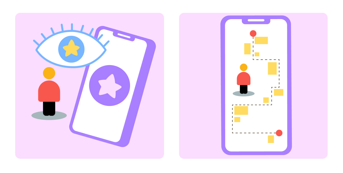
In this lesson, you'll build an app called Loop — a habit tracker for adults building daily routines. The home screen needs to show today's habits, a streak counter, a progress summary, and a clear way to check in.
The tool for the first draft is Uizard — an AI-powered UI generator that produces editable layouts from text prompts.
Open Uizard, start a new project, select Mobile as the project type, describe the app in the text field, then choose Generate with Autodesigner to reach the prompt field.
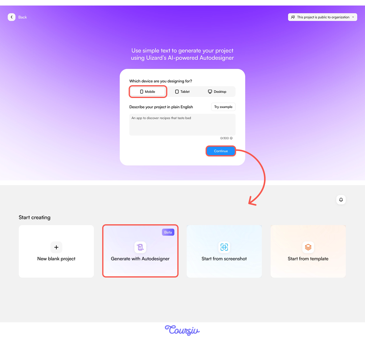
Note: Uizard's Autodesigner prompt field has a 150-symbol limit. Keep the prompt short and specific: describe the core use case, the key sections, and the visual tone. Everything else Uizard fills in based on the project type.
practice preview
Interactive practice
Fill in the blank
Complete the Uizard prompt to generate Loop's home screen layout.
Explore What Uizard Generated
Click any page to see the interaction flow — arrows connecting screens, each one configurable.
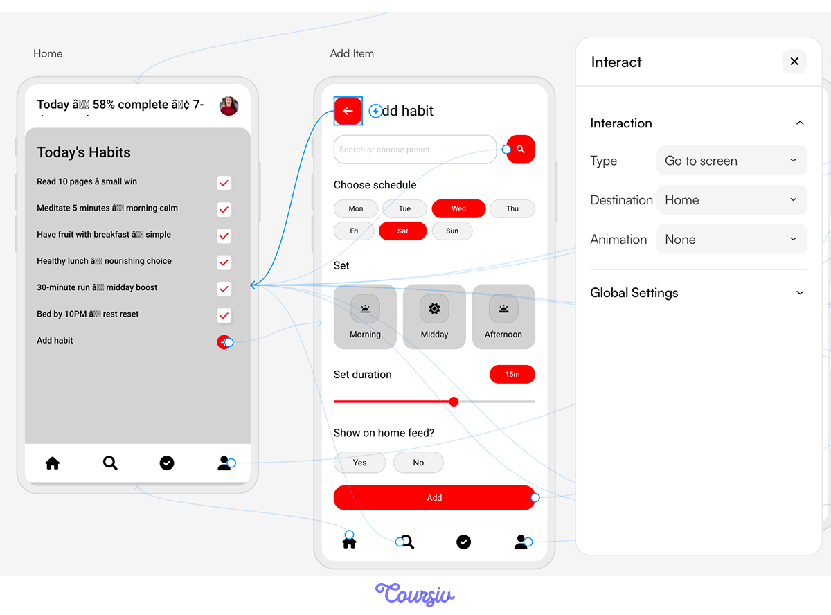
Click an arrow to set interactions:
- Type defines what happens when the user taps the element: "Go to screen" or "Open link."
- Destination is where the interaction leads: Home, Signup, Welcome, Add Item, Statistics, or any other screen in the project.
- Animation is how the transition between screens looks: Fade, Slide Left, Slide Right, Slide Up, Slide Down.
This is how Uizard maps the user journey: screen appearance and the transitions between them.
Now you have your first draft. Aside from what you requested, Uizard generated a welcome and a signup page with content sections, buttons, and placeholder text.
If you want to change any of that, the left navigation panel gives you everything Uizard offers.
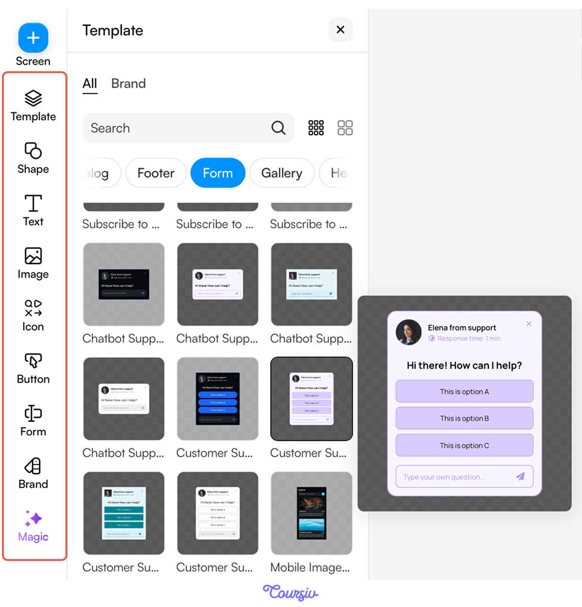
Uizard reliably handles structure: navigation placement, section grouping, and component sizing relative to each other. The layout is logical — a real user could navigate it.
But structure isn't design. Before moving forward, it's worth looking at what the generation got right and what it didn't.
Uizard's Magic
To evaluate what Uizard generated, use its Magic feature, the AI layer built into the editor. It can generate additional screens, swap images, apply new themes, rewrite content, and more.
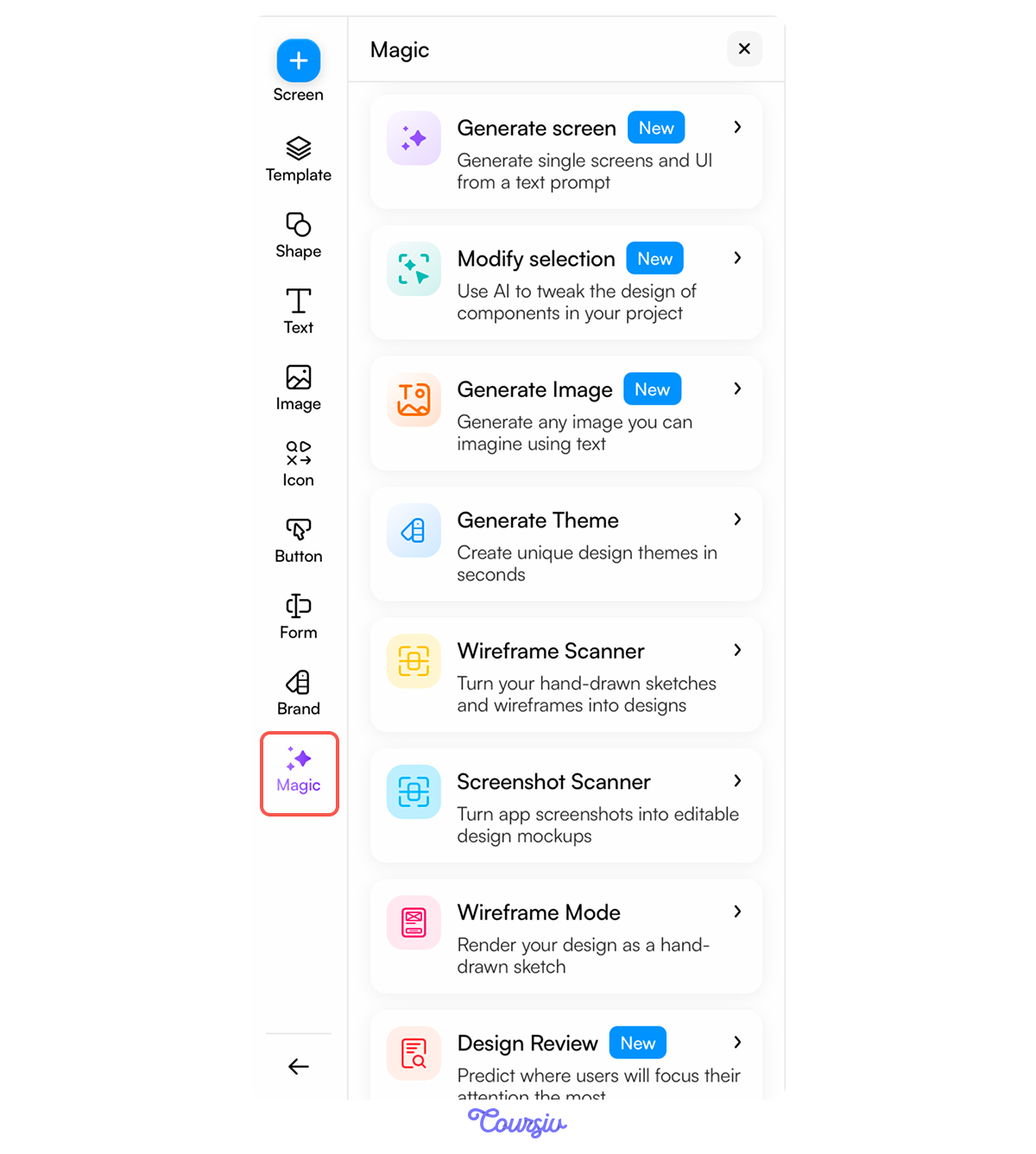
Choose one
You need to understand what works in the design that Uizard generated and what doesn't. What do you think is the most effective approach?
Run a Design Review With Magic
The most useful Magic function for evaluating a generated design is Design Review. Activate it from the Magic menu. Click on the screen you want to review, then hit the Magic button above it.
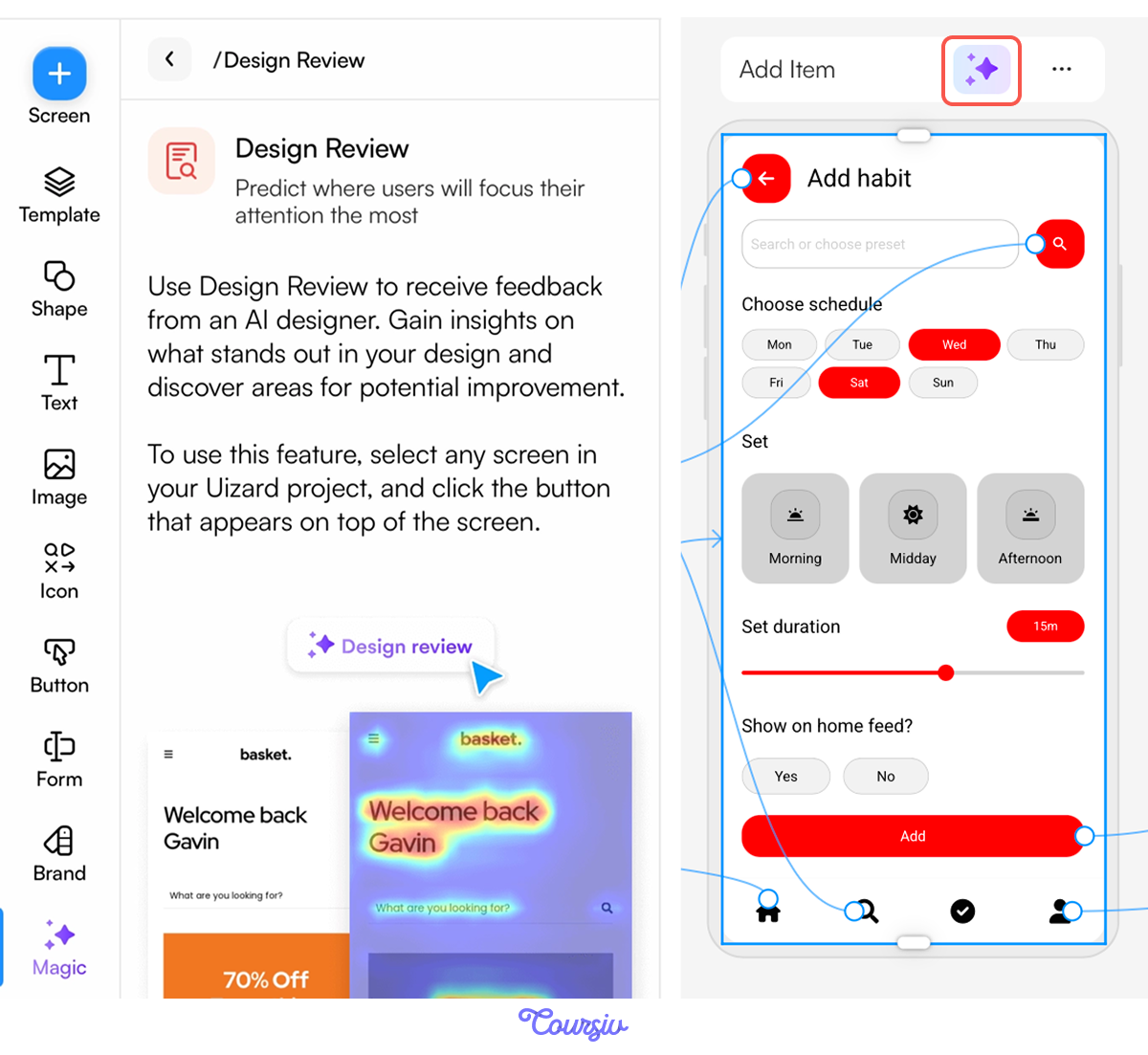
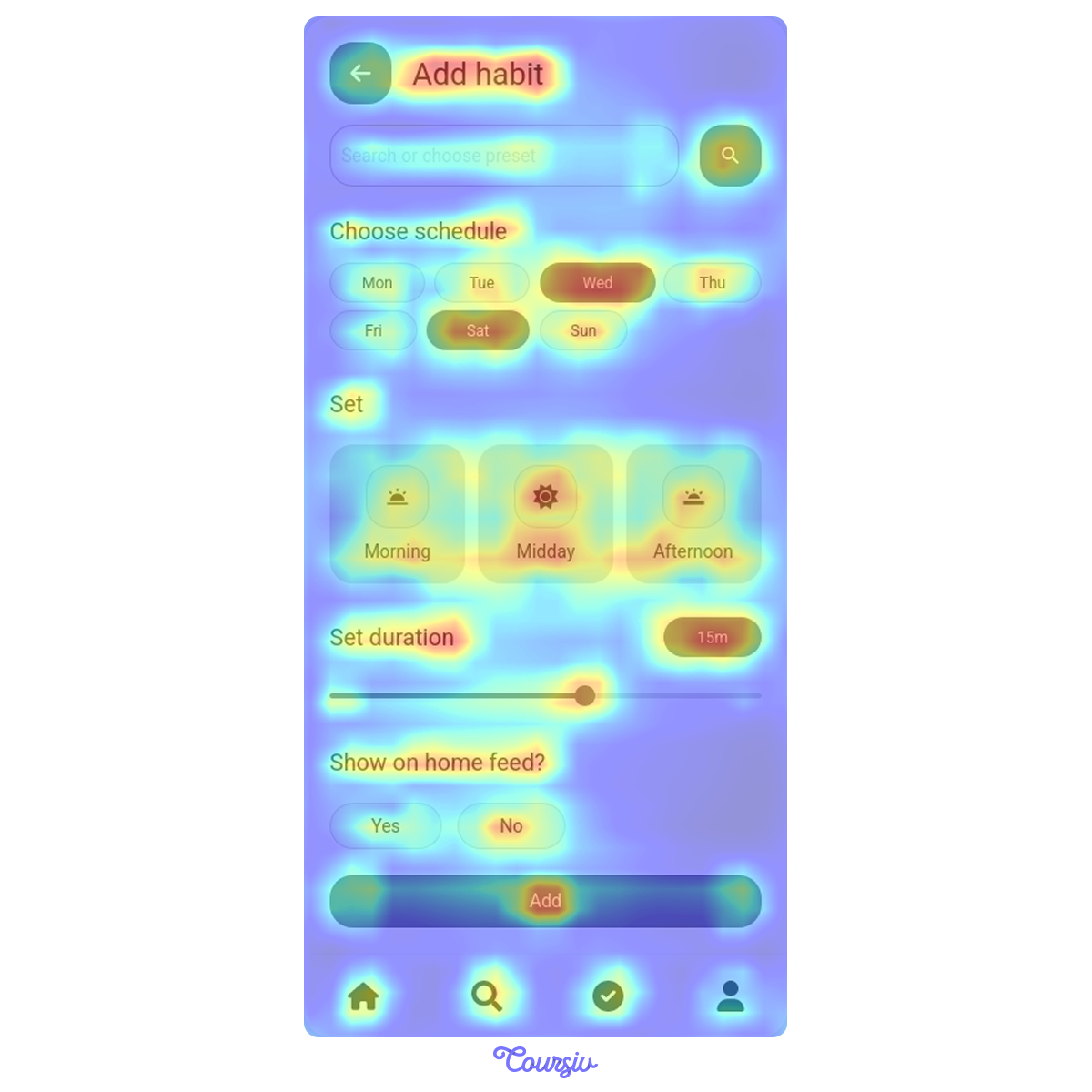
Design Review flags hierarchy problems visually. It produces a heatmap showing visual attention density (where users' eyes are likely to go).
- Red/yellow = high attention
- Blue/green = low
This is Uizard's heatmap for the Loop's "Add item" screen.
What Magic doesn't fix: hierarchy decisions and copy. Design Review will show you the problem. Deciding what to do about it is up to you.
practice preview
Interactive practice
Fill in the blank
Upload the Design Review heatmap to ChatGPT and ask it to identify UX problems and suggest fixes.
ChatGPT identified three problems: a weak CTA, inconsistent components, and no clear order for the user to follow.
The first fix recommended: establish a logical sequence. Name → Days → Time → Duration → CTA. That means the copy needs to change first — once the labels are clear, the structural fixes follow.
practice preview
Interactive practice
Fill in the blank
Ask ChatGPT to write UI copy for the "Add habit" screen following the recommended order.
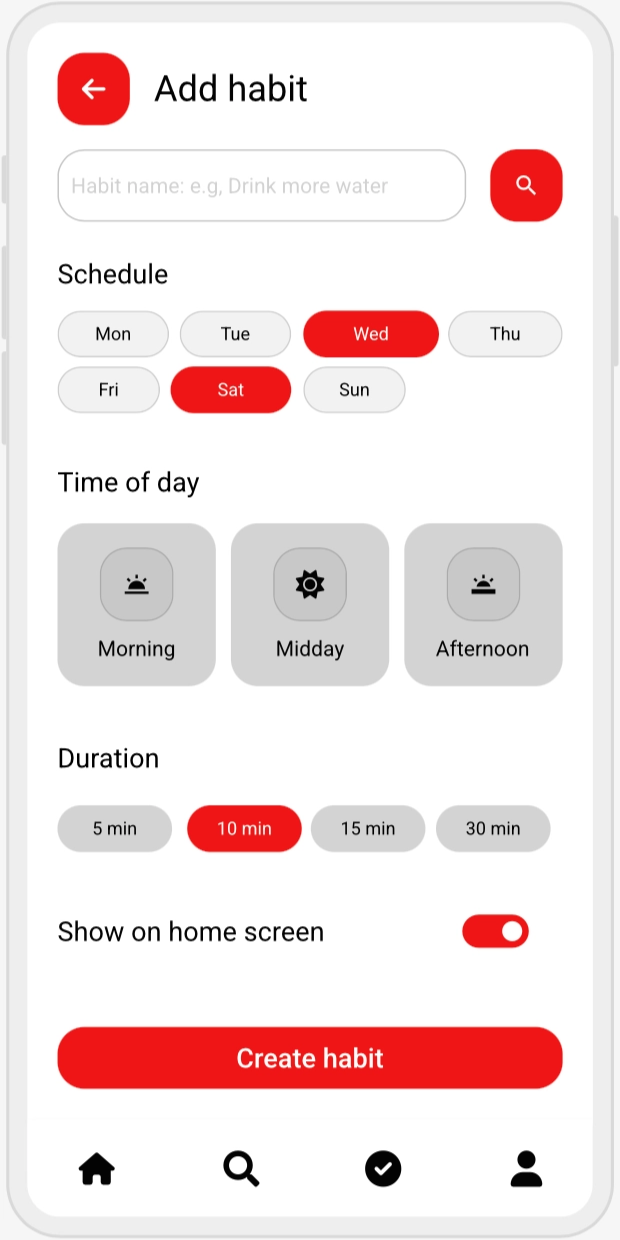
"Create habit" names the action and frames it as meaningful. "Add" did neither. "Schedule" and "Time of day" tell the user what each section is for. The copy gave the screen a logical reading order.
Evaluate Against Three UX Principles
The next step is evaluating what still needs to change structurally. Three principles cover the most common problems in AI-generated mobile screens — and in most UI design in general.

Hierarchy = what does the user see first?
On a well-designed screen, the most important element has the most visual weight: larger, bolder, higher contrast, or positioned at the top of the natural reading path.
Clarity = does every element communicate its purpose without explanation?
Labels, buttons, and icons should be self-evident. If a user has to guess what a button does, clarity has failed.
Flow = what does the user do next?
Every screen should have one primary action that's more prominent than everything else. If all actions look equal, the user hesitates.
Choose one
On the generated Loop home screen, the streak counter, the habit list, and the check-in button all have the same font size and visual weight. Which UX principle does this violate most directly?
The fixes are targeted; it's not a redesign. Change the CTA and rewrite labels with real copy that reflects what Loop does. Swap the duration slider for preset options (5, 10, 15, 30 min) to reduce cognitive load. Simplify the toggle to a single switch with a clear label.
With these changes applied, the screen looks like this!
Fix the Principle, Not Just the Element
When you resize the check-in button, you're fixing hierarchy. When you rewrite "Habit 1" to "Morning walk — tap to complete", you're fixing clarity. When you move the streak counter to the top, you're fixing flow. Name the principle before you make the change — it keeps fixes purposeful, not cosmetic.
- AI generates structure, you generate usability: A generated layout gives you sections, navigation, and component placement. Hierarchy, clarity, and flow come from your decisions — and Uizard's Magic Design Review shows you where the problems are.
- Heatmaps show what words can't: Design Review's visual attention map tells you which elements are competing for focus and which are disappearing. Use it as your first diagnostic before making any changes.
- Copy is part of the design: Placeholder labels and generic button text reach real users if left unchanged. Use ChatGPT to write copy that gives every field, button, and section a clear purpose.
- Fix the principle, not just the element: Unifying components fixes cognitive load. Enlarging the CTA fixes the hierarchy. Rewriting labels fixes clarity. Name the principle before making the change — it keeps fixes purposeful, not cosmetic.
What's Next?
You took a generated layout — structurally sound but visually broken — and turned it into a screen that's clear, logical, and ready for a real user. That's the full loop: generate, evaluate, fix.
In the next lesson, you'll take the evaluation across all of your work — using ChatGPT as a dedicated critique tool to catch problems you missed and generate alternatives worth testing.