AI in Design · Design: From Concept to Real Assets
Visual Brand Identity
Turn style into a brand kit
A Direction in Your Head Isn't a Brand Kit
FocusShift has a locked visual direction — warm, human, sage, and terracotta, rounded type. You know what it looks like. But knowing isn't something you can hand to a tool, a collaborator, or your future self at 11 p.m. trying to finish a social post. A brand kit is.

What Is a Brand Kit?
A brand kit is a single document that records every visual decision: the exact colors with hex codes, the fonts and how to use them, and the style rules that keep everything consistent.
Start With Color
The moodboard established warm sage, sand, and terracotta as the FocusShift palette. But "warm sage" means something different to different AI tools. One will reach for a muted olive, another for a grey-green.
A hex code removes this confusion. It locks the exact color so every tool, collaborator, and future design starts from the same point.
Colors also need roles: primary, secondary, and accent. Once each color has a job, it gets easy for you to create consistent designs.
practice preview
Interactive practice
Fill in the blank
Ask ChatGPT to assign hex codes and roles to the FocusShift palette.
A list of colors is a starting point. A palette is colors with assigned jobs — primary, secondary, and accent. Once each color has a role, every design decision has a rule.
Typography Carries Tone
FocusShift's direction is warm and human: rounded forms, soft textures, and approachable. The fonts need to carry the same feeling. A sharp geometric serif typeface would contradict everything the color palette is saying.
A brand kit uses two fonts:
- A headline font for titles and anything that needs presence
- A body font for paragraphs, captions, and interface text
They need to work together without competing.
Choose one
FocusShift's direction is warm, rounded, and approachable — targeting adults aged 40-60. Which font pairing fits best?
Nunito and Lato aren't the only valid pairing, but the logic behind the choice is what matters. The headline font sets the tone, and the body font supports it. Both should feel like the same brand.
If you want to find your own pairing, Google Fonts is the most practical starting point: filter by category, preview combinations side by side, and check that both fonts are free to use.
Search for the visual quality you're after — "rounded," "humanist," "geometric" — and compare how the headline and body read together at actual size.
Put It Together in Canva
Canva's Brand Kit feature is where all of this gets documented in one place. Colors with hex codes, font pairings with size roles, and a logo — all stored so every design you open starts from the same foundation.
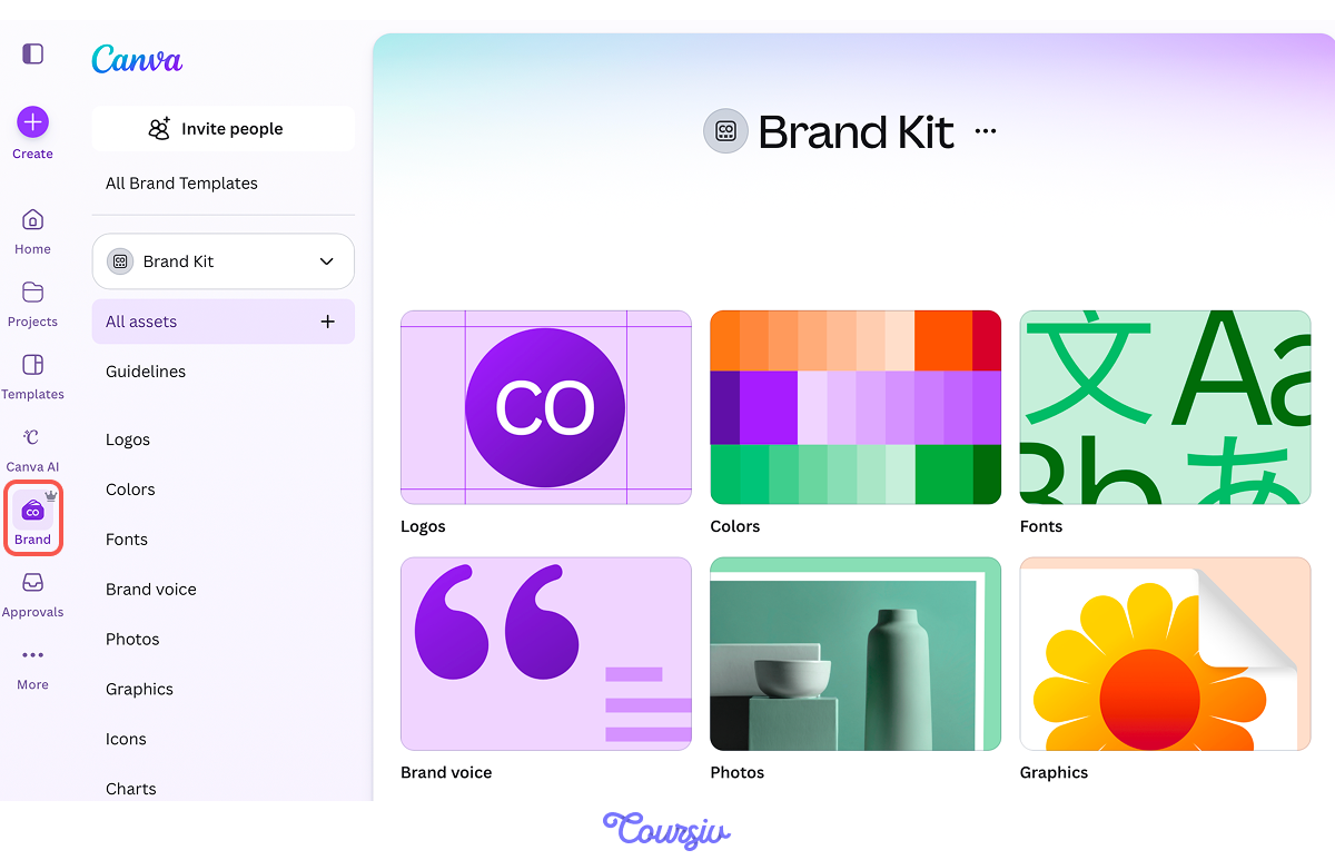
Setting it up takes less time than rebuilding it from scratch on your next project. Once it's there, Canva applies it to any template you open.
Write the Style Rules
The Canva Brand Kit stores the assets. The final step is turning them into a presentation — a document that explains the decisions behind them.
Canva has this built in: the Add guidelines feature lets you create a brand kit presentation directly inside the platform.
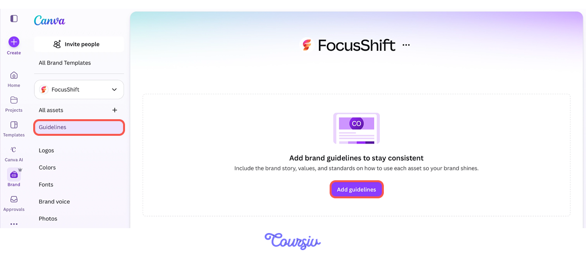
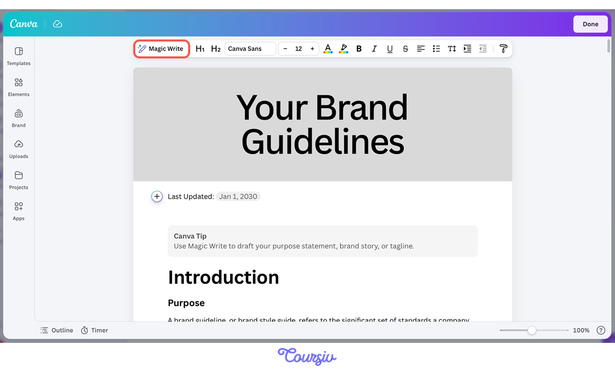
To draft the written rules, use Magic Write — Canva's AI writing tool built into the editor. Click "Magic Write," describe what you need, and it generates the copy inline.
practice preview
Interactive practice
Fill in the blank
Ask Canva's Magic Write to generate three style rules for the FocusShift brand kit.
Three rules cover the decisions that come up most often. They don't need to be exhaustive, but they need to be specific enough that two people applying them independently produce the same result.
practice preview
Interactive practice
Put in order
Arrange these steps in the correct order to build a complete, usable brand kit.
practice preview
Interactive practice
True / False
You've built the FocusShift brand kit. A colleague says it should stay fixed. Read the statement and decide.
- Colors need roles, not just names: Primary, secondary, and accent assignments turn a palette into a system. Each color has a job, and that job is the same across every design.
- Typography is tone in text form: Find your pairing on Google Fonts, then store it in Canva's Brand Kit alongside your colors and logo so every new design starts from the same foundation.
- The kit has two layers: The Brand Kit feature in Canva is the tool — it runs every time you open a template. The presentation is the bible — it's what you share, hand off, and return to when decisions need to be made.
- Written rules prevent drift: Use Canva's Magic Write to draft one sentence per major decision.
What's Next?
Great! You've created a visual brand identity for FocusShift — now, the brand has a great foundation to build its launch strategy.
In the next lesson, you'll take the visuals further — removing backgrounds, extending compositions, and cleaning up images without touching Photoshop.