No-Code Websites and Apps · Build Your Product with AI
Website Structure and Design
Brand and structure your website
Website Structure and Design
You have a website draft with pages and structure — now it's time to give it an identity!
In this lesson, you'll give BrightMinds unique visuals, shape the visitor journey so parents sign up, and add subscription logic so the site can generate revenue.
Visual Identity Makes It Real
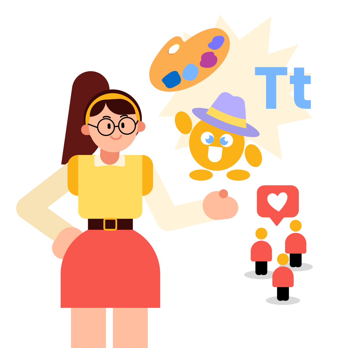
A website draft starts to feel like a real product when it has a consistent look and feel.
Visual identity includes colors, typography, and personality elements like a mascot. For a children's educational site, a mascot makes the brand instantly recognizable — appealing to kids and trustworthy to parents.
practice preview
Interactive practice
Fill in the blank
Use ChatGPT to generate a mascot concept for BrightMinds.
Meet Professor Whiskers
A text description is a starting point. Let's see the mascot to evaluate it! We will use Midjourney — an AI image generator that creates visuals from text prompts. It's especially strong at stylized, illustrative work — exactly what a mascot needs.
practice preview
Interactive practice
Fill in the blank
Ask Midjourney to create an image of Professor Whiskers based on the concept.
- --ar (aspect ratio) 1:1 sets the aspect ratio to a square — ideal for mascots and logos that need to work across different placements.
- --style raw tells Midjourney to follow your prompt more literally instead of adding its own artistic interpretation. For a brand mascot that needs to look consistent and controllable, these two parameters keep the output clean and usable.
Apply the Identity to Your Site
You have a mascot and a color direction. Now bring them into Lovable. To add the Professor Whiskers image, drag and drop the Midjourney file directly into Lovable's chat panel — the AI will analyze it and place it in your project. Pair it with a prompt that sets the full visual direction.
practice preview
Interactive practice
Fill in the blank
Upload Professor Whiskers's image and write a prompt to apply the visual identity.
BrightMinds now has a visual identity that supports the product! Let's move on to how visitors move through the site.
The Visitor Journey
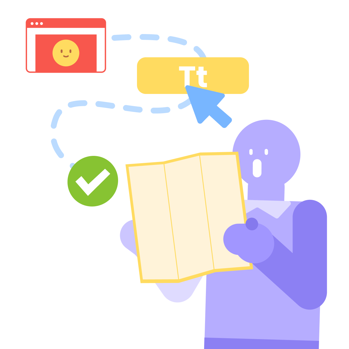
A visitor journey is the path someone takes from arriving on your site to completing the action you want. Every page, section, and button should move them one step closer.
In Lesson 1, you've already navigated the user's journey towards a clear action within the main page. You also created an additional page on your website. Let's now dive deeper into the whole website visitor's journey design.
Map It Before You Build It
Most websites lose visitors because the journey has gaps — unclear next steps, missing information, or dead ends. AI can help you spot these gaps before you redesign anything.
practice preview
Interactive practice
Fill in the blank
Ask ChatGPT to map the complete visitor path across all BrightMinds pages.
Navigation Should Match the Journey
You've mapped the path — now the site's navigation needs to support it. Right now, your menu probably lists every page equally. But not every page deserves top-level navigation. You should move the pages that distract from the main journey to the footer or remove them entirely.
practice preview
Interactive practice
Fill in the blank
Prompt Lovable to restructure BrightMinds navigation around the visitor journey.
Great!
The site now guides visitors from curiosity to action without detours. Let's add the feature that makes this business work.
Gated Content and Subscriptions
BrightMinds offers educational lessons — some free, some behind a subscription. This is called gated content: certain pages or features are only available to paying users.
The free content proves the product is worth it. The gated content gives people a reason to pay.
Set Up Gated Content in Lovable
Adding a subscription model starts with telling Lovable which content is free and which is paid.
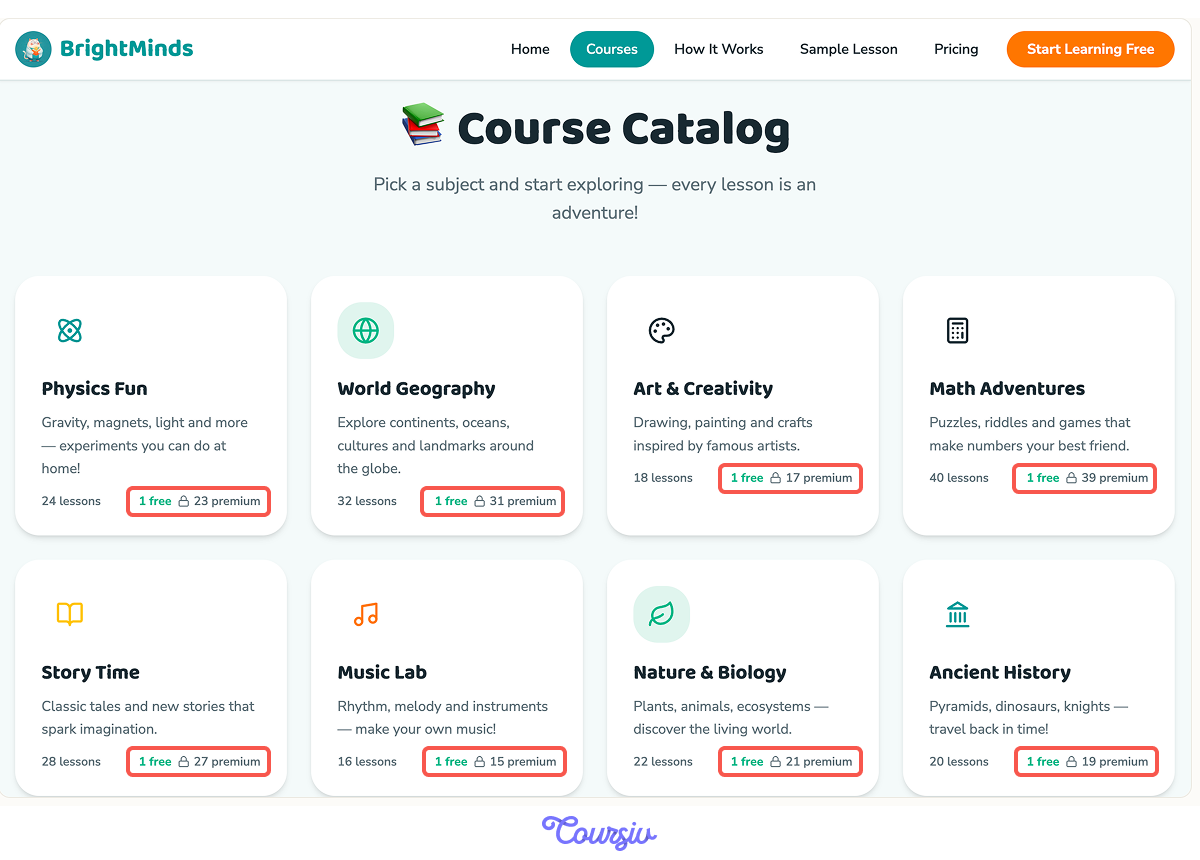
In your chat panel, describe the split clearly: "Make the first lesson in each subject free. Gate quizzes, progress tracking, and advanced lessons behind a Premium subscription."
Free and Premium Labels
Lovable will add Free and Premium badges to your lesson cards in the catalog. Free lessons are open to any visitor. Premium lessons are visually marked so parents know what's included in each tier before they click.
Check the Flow
Preview the site and click through as a parent would. Open a free lesson — it should load without any barriers. Then click a Premium lesson — the modal should appear immediately with a clear path to sign up. If anything feels off, describe the issue in the chat panel, and Lovable will adjust it.
- Visual identity — colors, mascot, typography — makes a website feel like a real product, not a draft.
- The visitor journey is the path from landing to action — every page and button should move users closer to the goal.
- Navigation should support the journey, not clutter it — remove pages that create detours.
- Gated content works best when the free tier proves the product's value and the paid tier deepens the experience.
What's Next
BrightMinds now looks, feels, and functions like a real product — with a brand identity, a clear path to conversion, and a subscription model in place. In the next lesson, you'll take this further by turning the website concept into a no-code app.
Let's keep going!