No-Code Websites and Apps · Build Your Product with AI
Your App User Experience
Design a professional client app
Design the App Interface and User Experience
You know how to build an app from scratch. It's time to use your skills for a paying client. Imagine this: a local fitness studio asks you to create an app for their members. Class bookings, schedules, trainer profiles.
In this lesson, you'll design a polished, user-friendly app for a client — and learn the UX principles that make any app feel professional.

The Client Brief
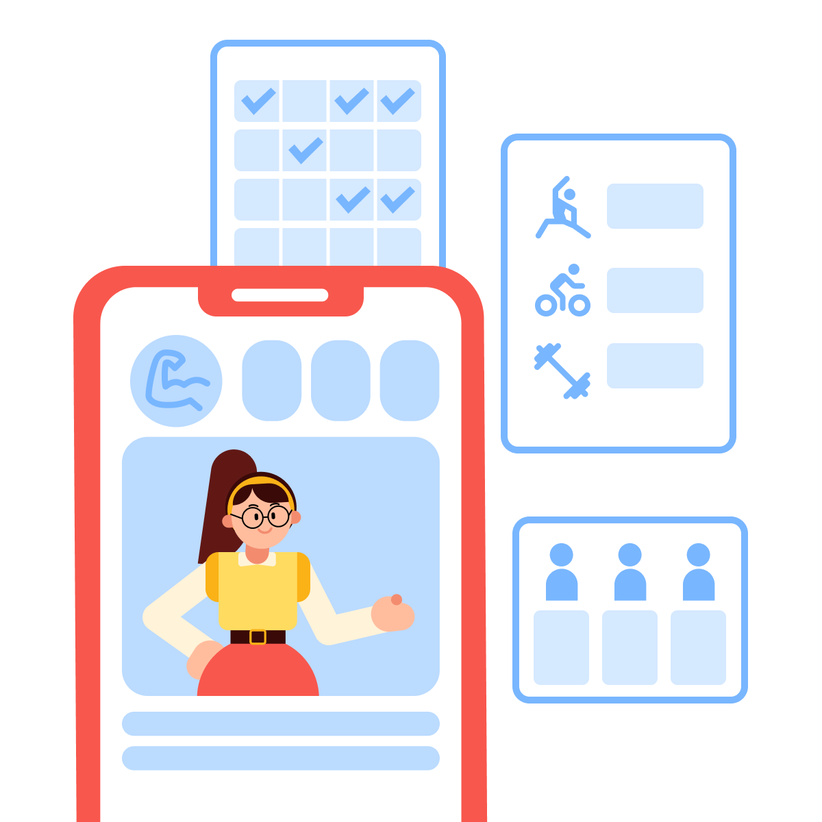
FitBase is a small fitness studio offering group classes — yoga, strength, and cycling. They want an app where members can browse the schedule, book classes, track attendance, and see trainer profiles. Right now, everything runs through Instagram DMs and a shared Google Calendar. They need something better.
Define the App Structure
Before you open Bolt.new, define what the app needs. The process is the same as BrightMinds, but the product is different.
practice preview
Interactive practice
Fill in the blank
Ask ChatGPT to build the core structure for the fitness studio app.
From Structure to Builder
You've got a clear blueprint: screens, actions, and data. Let's turn it into a working app. Open Bolt.new and use the structure ChatGPT defined as the foundation for your first prompt.
practice preview
Interactive practice
Fill in the blank
Write a Bolt.new prompt to create the first version of the FitBase app.
Start With a UX Audit
You have a working draft. To implement changes wisely, walk through it as a member would. A UX audit means testing the flow and noting where things feel confusing, slow, or unclear.
practice preview
Interactive practice
Fill in the blank
Upload your FitBase screenshots and ask ChatGPT to review them.
Fix What Matters First
The audit provided you with a prioritized list. Start with the issue that was flagged first and affects the most users — onboarding.
practice preview
Interactive practice
Fill in the blank
Prompt Bolt.new to add a first-time user onboarding flow.
Onboarding Added
New members now get a clear introduction before they see the schedule.
Navigation That Fits the Workflow
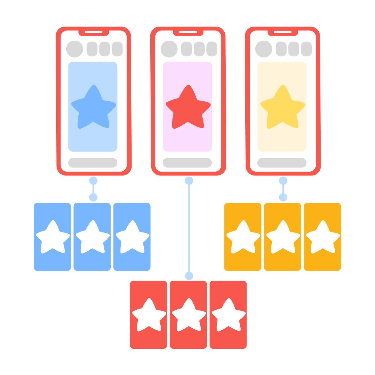
Let's focus on the navigation flow. Not every screen belongs in the bottom navigation. Primary screens — the ones members use every session — get a tab. Secondary screens are reached from inside primary ones.
practice preview
Interactive practice
True / False
Should this screen be in the main tab bar or accessed from another screen?
Micro-Interactions Matter
Another important point from your audit: no booking micro-interaction. When a member taps "Book" and nothing visible happens, they'll tap again — and accidentally double-book. Micro-interactions are small visual responses that tell the user "it worked."
practice preview
Interactive practice
Fill in the blank
Prompt Bolt.new to add feedback animations to the FitBase app.
Great Work!
That confirmation card from the micro-interactions prompt is doing an important job. It's solving the audit issue — members now know their booking worked. A good confirmation shows what was booked, when, and what to do next (like adding it to their calendar).
Test the Full Experience
You've refined onboarding, micro-interactions, and confirmations. Now test the complete flow — focusing on how the app feels, not just whether it functions.

Your Testing Checklist
Open the preview on your phone and walk through these scenarios:
- A new member opens the app for the first time.
- A returning member books a morning yoga class.
- A member cancels a booking last minute.
At each step, ask: Was the next action obvious? Did the app respond to your taps? Did anything feel confusing?
practice preview
Interactive practice
True / False
Is this a useful or useless way to test your app?
Deliver the App to Your Client
You've built and tested FitBase. Now it's time to hand it over. In Bolt.new, click Publish to deploy the app to a live URL — every project gets a free host address (e.g., fitbase.bolt.host). Share this link with the studio owner so they can see the live product.
What a Good Handoff Includes
Walk the client through how to use the product: checking bookings, viewing member accounts. For full handoffs, you can also push the project to GitHub (a website where people work together on code and other project files) so the client owns the code.
- Start with a UX audit: Identify friction before you redesign.
- Onboarding usually has 2-3 screens: What is this, how does it work, what should I do first.
- Only primary screens belong in the tab bar: Secondary screens live inside primary ones.
- Micro-interactions give users instant feedback that their action worked: A button state change, a checkmark, or a confirmation card tells the user their action worked.
- Test on a real device following real scenarios: Not simply checking that screens render, but completing tasks end-to-end.
What's Next
You've designed a polished, consistent app for a real client scenario — and the UX principles you practiced work for any app, including BrightMinds. In the next unit, you'll focus on the product launch and monetization of your websites and apps, including the implementation of AI-powered features for maximum efficiency.
Let's keep going!