AI Copywriting · Copywriting Across Formats
Web and Landing Page Copy
From hero section to CTA
Pages That Convert
A visitor clicks your headline. They land on the page — and stay there for quite a while, because both the headline and the landing page did their job.
In this lesson, you'll learn how to create high-converting landing pages, write each section, make web copy scannable, and address objections before they stop the reader from acting.

Select all that apply
What do you think makes a landing page different from a regular website page?
A landing page is a standalone page designed around a single goal.
Unlike a homepage, which introduces your brand and gives visitors multiple paths to explore, a landing page removes all navigation and distractions. One thing to read. One thing to do.
That focus is what makes landing pages convert. Homepages say, "Here's everything we do." Landing pages say, "Here's one thing we want you to do right now."
The Anatomy of a Landing Page
High-converting landing pages follow a predictable structure. It mirrors how people make decisions — from understanding the offer to trusting it to acting on it.

Here are the landing page core sections:
- Hero: Headline, supporting line, and CTA. Answers: What is this? Who is it for? What do I do next?
- Benefits: What outcomes does the reader get? Framed as results, not features.
- Social proof: Testimonials, numbers, logos, case studies. Answers: Why should I trust this?
- Objection handling: Addresses the reader's hesitations before they become reasons to leave.
- Final CTA: Restates the value and gives a clear, confident action step.
Each section does one job. Let's build them one by one.
Section 1: The Hero
The hero section is the first thing visitors see, and it needs to answer three questions instantly: What is this? Who is it for? What should I do next?
If the reader can't answer all three within a few seconds, they'll leave. Your headline, supporting line, and CTA button work together to deliver clarity immediately.

practice preview
Interactive practice
Fill in the blank
Use Claude to write a hero section with clear answers to all three questions.
Section 2: Benefits
Once the reader understands the offer, they need to see what it specifically does for them. The benefits section translates features into outcomes — the results the reader cares about.

A common mistake is listing features instead of benefits.
- Feature: "AI-powered spending analysis."
- Benefit: "See exactly where your money goes each week — without logging a single transaction manually."
Features describe the product. Benefits describe the reader's life after using it. Always lead with the benefit, then mention the feature as the mechanism behind it.
practice preview
Interactive practice
Fill in the blank
Use Claude to write a benefits section that leads with outcomes.
Section 3: Social Proof
The reader now understands the offer and the benefits. The next question in their mind: "Why should I believe this?"
Social proof answers that question by showing that others have already trusted the product and gotten results.

Effective social proof can take several forms:
- Testimonials: real quotes from real users, ideally with specific results
- Numbers: user counts, results metrics, time saved ("12K users saved an average of $200/month")
- Logos: recognizable brands or media mentions
- Case studies: short stories showing a specific transformation
Choose one
Which social proof line is most effective for a landing page?
Section 4: Objection Handling
Even if readers are interested, they'll have hesitations — reasons not to act. The best landing pages anticipate these objections and address them directly, before the reader uses them as an excuse to leave.
Common objections across most products include:
- Price: "Is this worth the money?"
- Effort: "Will this be hard to set up or use?"
- Trust: "Is this legit? Will it actually work?"
- Timing: "Do I need this right now?"
You don't have to answer all of them. Identify the top 2-3 for your audience and address those directly on the page.
practice preview
Interactive practice
Fill in the blank
Use Claude to identify the most likely objections for your audience and write copy that addresses each one.
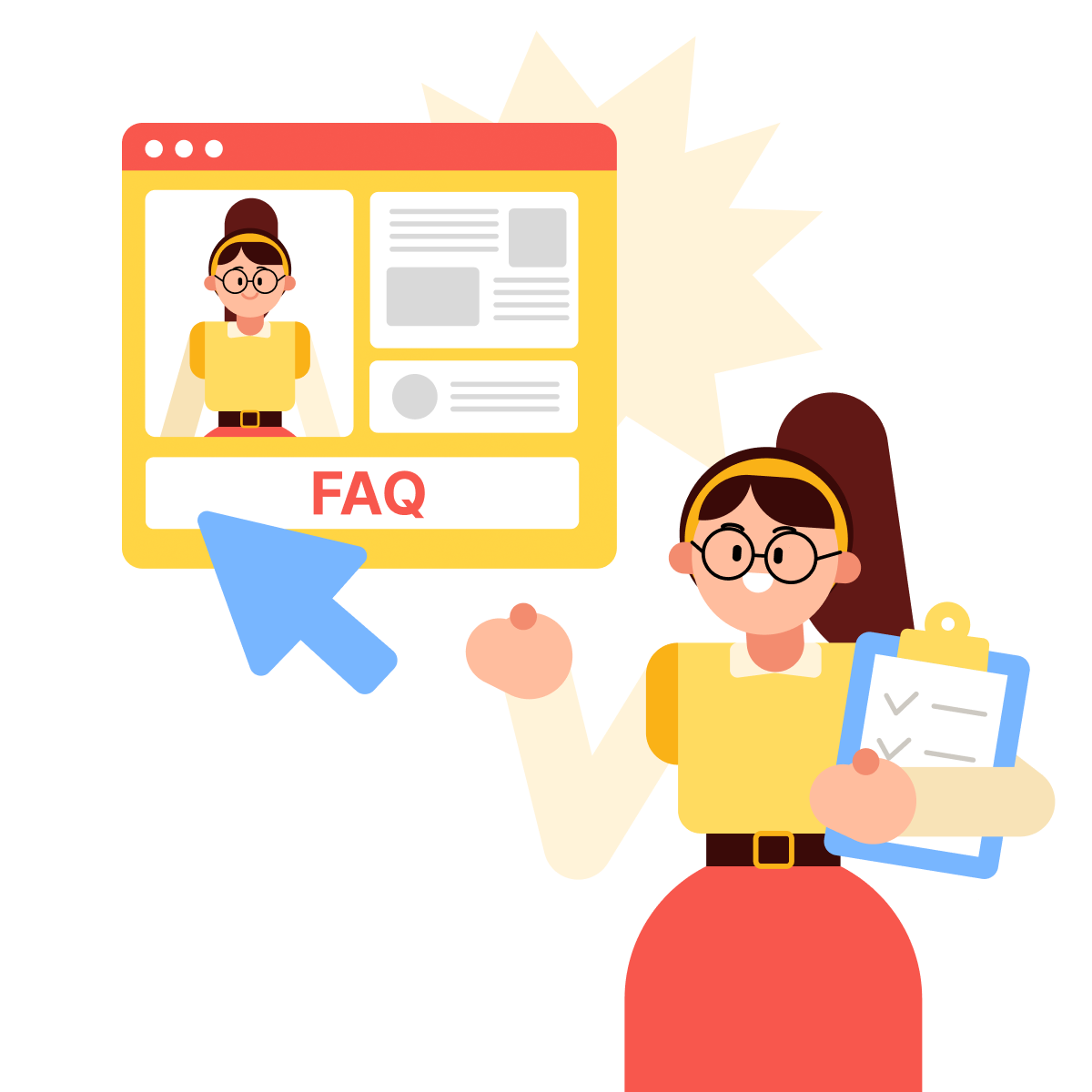
Notice the format: each objection is stated in the reader's own voice, then answered directly. This creates a conversation — the reader feels heard, and the answer removes the barrier. This technique works especially well as an FAQ section near the bottom of the page.
Section 5: The Final CTA
The final CTA restates the value and gives the reader one last, clear push. It should feel confident and specific — not desperate. The reader has already seen the offer, the benefits, the proof, and the answers to their objections. Now they just need a clear next step.
Effective final CTAs often:
- Restate the key benefit: "Start saving without thinking about it."
- Reduce friction: "Free for 30 days. No credit card required."
- Create gentle urgency: "Join 12K users who already took control of their money."
Combining a benefit restatement with a friction reducer is one of the most reliable patterns for final CTAs.
A Structure You Already Know
The landing page structure maps directly to the AIDA framework you practiced in Lesson 4:
- The hero section grabs Attention.
- Benefits build Interest.
- Social proof and objection handling create Desire.
- The final CTA drives Action.
Making Web Copy Scannable
Even with a strong structure, landing page copy fails if it's hard to read. Most web visitors scan — they don't read word by word. Your copy needs to work for scanners first and readers second.

Here are the rules for scannable web copy:
- Short paragraphs: Long blocks of text get skipped.
- Clear subheadings: Every section needs a heading that communicates the key point, even if the reader skips everything else.
- Bullet points for lists: When you have three or more items, use bullets instead of long sentences.
- Bold key phrases: Guide the scanner's eye to the most important words.
AI can quickly restructure dense copy into a scannable format. Paste a paragraph and ask it to break the text into short, scannable sections with subheadings.
B2B Landing Page — What Changes
The landing page structure stays the same for B2B — hero, benefits, proof, objections, CTA. What changes is the content inside each section, because B2B readers make decisions differently.

Key B2B adjustments:
- Hero: Focus on business outcomes (efficiency, ROI, risk reduction) instead of personal ones. Include the reader's role or company size for relevance.
- Benefits: Frame around team or organizational impact, not individual convenience. "Saves your ops team 6 hours a week" beats "Saves you time."
- Social proof: Company logos, case studies with revenue metrics, and named decision-makers carry more weight than individual reviews.
- Objections: Add implementation concerns ("How long does onboarding take?"), security/compliance questions, and stakeholder buy-in ("How do I pitch this to my VP?").
- CTA: B2B CTAs are often lower-commitment than B2C CTAs. "Book a demo" or "Talk to sales" works better than "Buy now," since B2B purchases usually involve multiple stakeholders.
practice preview
Interactive practice
Match pairs
Tap a left item, then a right item to match.
B2C proof feels personal (individual users, relatable results). B2B proof feels institutional (company names, team metrics, business outcomes).
The structure is identical. The language inside each section shifts based on who's making the decision and how they justify it.
Principles to carry into every landing page you write:
- One page, one goal: Every section moves the reader toward that goal.
- Benefits over features: Lead with the outcome the reader gets, then explain the mechanism behind it.
- Specific proof wins: "$1400 saved in 4 months" beats "Great app!"
- Scannable format is non-negotiable: Short paragraphs, clear subheadings, bold key phrases — write for skimmers first.
Next Steps
Great job! In the next lesson, you'll take the landing page structure deeper and apply it to product pages — where the focus shifts to conversion-ready copy built from a clear offer and message triangle, with separate strategies for B2C and B2B buyers.
Let's keep going!